3 Keys to Killer Billboard Design

Since their inception, billboards have served as a key method of building brand awareness and directing customers to brick and mortar establishments. Even in the digital age, billboards remain a key element in an overall marketing strategy. To be effective, billboards need killer design and messaging to draw the customers in. The 3 keys to killer billboard design are: simplify, be bold and include a short call to action.
Key #1: Simplify
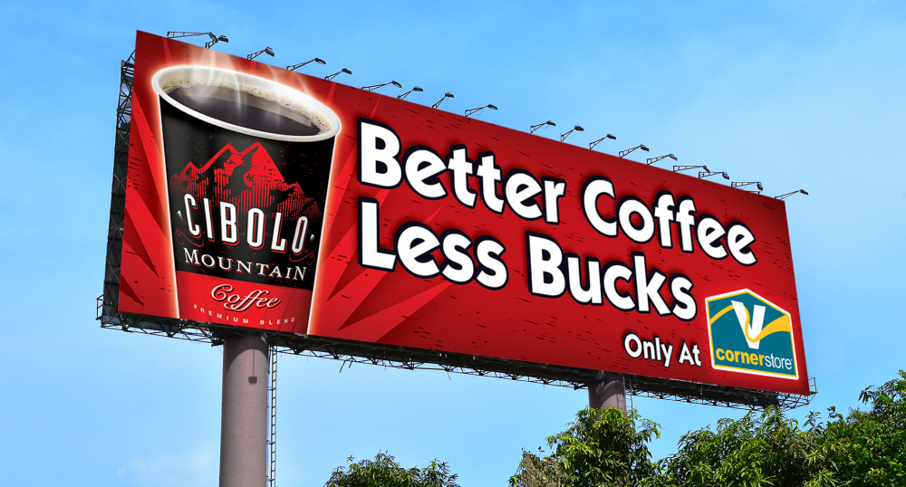
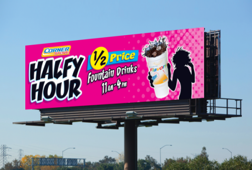
When it comes to billboards simplicity is key. This means simplifying the messaging and imaging. Billboards are read at great distances and at high speeds. The time it takes a person who is driving on the highway to read a billboard is usually around six seconds. So around six words is all you really should be using to get your message across. You need to be quick and direct in your message and visuals or miss your chance of getting that driver to exit and visit your store.
Key #2: Be Bold
 Bold visuals get noticed. Taking the time to apply fundamental design principles to your billboard will pay off tremendously. For instance, when choosing a color palette you want to select colors that have a good balance with each other and offer that pop that will draw a viewers eye. Imagery needs to be captivating. Think great photography or illustration. But be careful not to use imagery that is too busy. Lastly, pay attention to the fonts you use. Font design can sometimes be overlooked on a medium like billboards, but utilizing clean readable fonts is crucial in conveying your message in that short six-second time-span we discussed earlier.
Key #3: Short Call to Action
A short, clear call to action is critical—that is if you want your billboard to result in a new customer. An effective call to action excites a potential customer and drives them to engage with your product or brand. Be specific with phrases such as “exit now” or “call today.”
Above all, don’t try to cram too many visuals or a long-winded message on your billboard. These are difficult to read and most drivers won’t even try. Remember the six-second rule. Billboards aren’t the star in your overall marketing campaign approach, but they are great for sending a quick message. To be effective though, simple, bold, and actionable are the best approach.

