Breaking Through the Retail Clutter

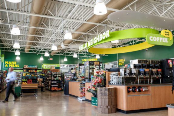
It’s 100 degrees out. The heat is bearing down on you, you’re parched and fading fast. You pull up to the nearest convenience store to run in and buy your usual thirst quencher. You’re on auto-pilot walking the aisles past a sea of monotonous point of sale, floor graphics and display signage all begging for you to look their way and engage with whatever brand is being promoted. But you are a hot thirsty sweaty zombie, your only focus is to get to the cooler door and buy the beverage you always get. Nothing will stand in your way.
Then, something catches your eye. The graphics are fresh and engaging. The clever headline makes you chuckle. The promotion is enticing. You forget your go-to drink and buy the brand with the catchy display and promotion. In an instant your brand loyalty is severed.
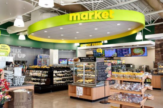
 Point-of-Sale marketing presents an interesting design challenge: How do you effectively break through the retail clutter? In this highly competitive marketing landscape, retailers are jockeying for position to gain advantages over each other and secure the customer’s brand loyalty. Most retailers have their go-to tactic, cost control or trying to win on price.
Others get caught up in the tech race, focusing on new slick apps, websites and other digital experiences to reach all mobile device shoppers. And while all these are necessary and valid approaches to breaking through the clutter of the retail landscape, fundamental graphic design and typography are often overlooked.
Great design has that “wow” factor that makes products more desirable and services more appealing to users. The best in class examples do what all good design does – they convey a message clearly and effectively while being visually engaging. In a busy competitive environment this is a must.
Uncluttered Design
First impressions matter and you only get one chance to make it a good one. Often, when customers walk into a store they are engaging with your Point-of-Sale for the first time. This is true for your standard marketing as well as when you are unveiling a new promotion or new flavor. Your first impression should be clean, engaging, and easy to understand. Minimal, uncluttered design is a friendly “hello” to someone who doesn’t know you as a brand or is engaging with your promotion for the first time. More importantly, a clean design establishes a small but hopeful first glance for the customer – a refuge in a sea of clutter and sameness. Don’t be mistaken, uncluttered design doesn’t mean boring, though if not done well can come across as stale and predictable.
Be A Design Thinker
“Most people make the mistake of thinking design is what it looks like. People think it’s this veneer — that the designers are handed this box and told, ‘Make it look good!’ That’s not what we think design is. It’s not just what it looks like and feels like. Design is how it works.”
— Steve Jobs
When tackling design problems for clients it’s very easy to dive right into the project eagerly and, as Steve Jobs says “Make it look good!” It’s in the designer’s nature to do so. It’s what they are programmed to do. However when you see best in class graphic design at retail you are seeing a byproduct of design thinking blended with consumer psychology and marketing best practices in order to meet client goals. Design thinking is, fundamentally, a strategic approach to problem solving. If the definition of design is solving a problem, then the definition of strategic design is solving the right problem. Design thinkers do both.
 Design thinking can be described as a discipline that uses the designer’s sensibility and methods to match client’s needs with what is technologically feasible.
Using techniques and technologies like interesting die cuts, dramatic pop-outs to give your displays dimension, or various types of printed finishes that turn your designs into visual experiences you can touch and feel are effective ways to make your designs unique and stand out from the crowd. In addition to textural elements, strategic use of color and imagery help draw the eye and lure customers in to your display. Above all, a message that is clear, simple, and focused is the best way to draw customers in and drive them to buy.

